 |
rpsoft 2000 RECENT CHARTS Graphs, Charts From USA Data |
|
|
RECENT US FINANCIAL CHARTS
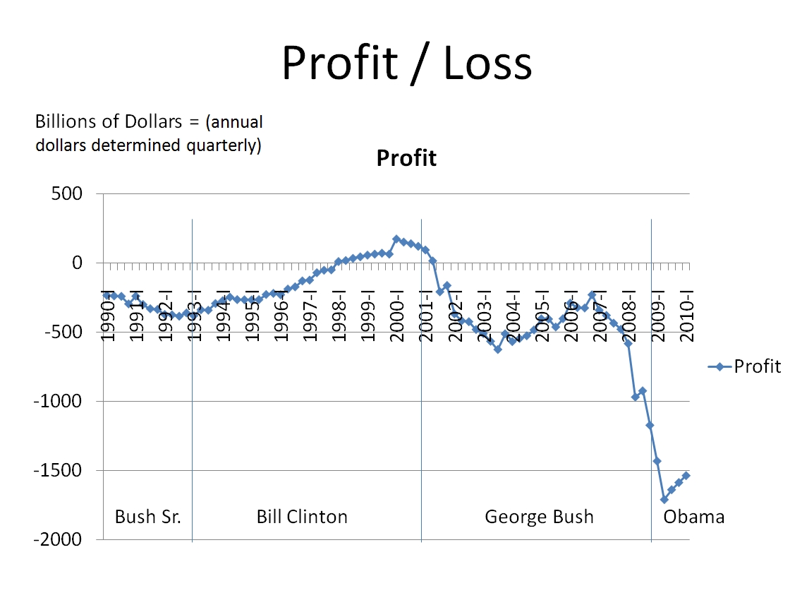
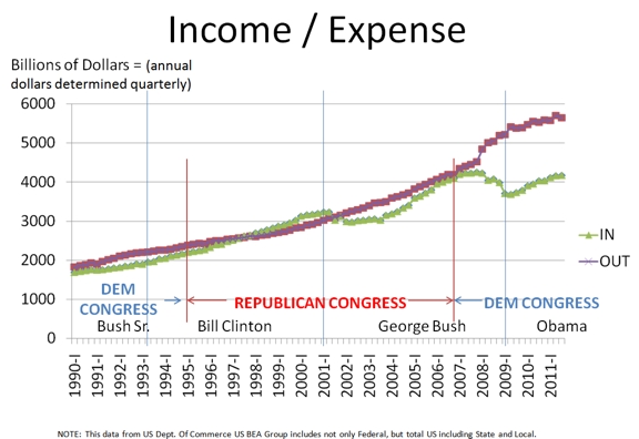
The Above Profit and Loss Graph of course is mostly just income coming into the total Government (Federal plus State plus Local) minus expenses. The chart right below one can argue is really the same chart, but it just shows income and expense separately instead of them subtracting from each other to determine profit.
The above chart again is just really the income / expense detail that makes up a profit and loss statement for the government. If the green line is high then all is great - more money coming in than going out. If the red line is higher than the green line, then the government is losing money and adding to its huge debt. Now in my opinion, there are a few points in the above that I do realize that those in politics will hate me saying, but I am just looking at math here. The US has been running a debt for a long time - since the days of Eisenhower - or at least around there. Since the days of "Ike" we have been going into debt. However, look back 12 years ago on this chart and you will find something amazing. And that amazing thing is that just 12 years ago or so President Bill Clinton while working closely with a Republican Congress managed to run a "PROFIT" for four years. Let me say that again, When Bill Clinton worked with the Republican Congress we ran a profit in the US for four years, and that was just 12 years ago. Today we keep hearing that that US must run $1500 billion a year in debt and that is just fine. Huh? Why should anyone accept that knowing that not so long ago we not only balanced the budget but made a small profit and starting SHRINKING our debt. Now I do not want to go too far here since I am aware that some people who have seen this make this too good either since they do not understand it or it is on purpose. Some say that Bill Clinton left office with a Surplus. Nope. Bill Clinton left office with about $5.7 Trillion of US debt, and he had added almost a trillion dollars to it. I have even heard a few people make the ridiculous claim that Bill Clinton left office with a $5.7 trillion dollar surplus. Nope. That would be a $11.4 trillion dollar error since they have the plus and minus signs wrong. But the problem is to give the team of Bill and the Republican Congress credit for working together and achieving profit for four years. Profit is a yearly measurement, where some of us see the word "Surplus" as the accumulation of debt or savings. What was done well were four yearly measurements in a row. For those who say that the answer might not be either political party but that they must work together, well, that seems to be what this data shows. Also quite inherent in these charts are the recessions. One could argue that what I mostly see in these charts are recessions and whether or not there was a recovery after them. Three obvious recessions on this chart. George W. Bush (the younger) had to face three of them. He had two recessions in 2001 - the dot.com recession followed by the 911 attack. Both of those were damaging to the US economy. To combat them, Bush did come out with the help of Congress to cut taxes for all Americans. Note starting at 2003 that the tax cuts did not cause a drop of income as some claim, but it actually increased income by over $1 trillion dollars between 2003 and 2007. Yay! Now some on TV say that that is impossible. No it is not. The Laffer Curves say that sometimes raising taxes makes more money and sometimes lowering taxes makes more money - depending on where you are when you do it. But in this case, the US made a lot of money reducing taxes. If you still find this bothersome, forget Laffer. Instead ask yourself what does a store do when it wants more money? A store most often reduces prices (their form of taxes) and are nice to customers. The belief is that if they lower prices more people will participate, and more money comes in. Few stores raise prices and treat customers badly when they want more money. Now many will say as I continue to hear that Federal profit and loss is different from stores and home economics. I say - "Not that I have noticed". I have never been in charge of US finance, but I have been responsible for fixing Profit and Loss statements of $1 billion a year, $20 million a year, and $1 million a year. I see no difference. Logic is logic. And if someone still disagrees, then I say the job is up to them to explain the curves which show that US income went up after the tax breaks - which is simply a matter of US public record. Wise people first look at the data and figure out why.... and do not start with their opinions and cheat the data. The last recession during the Bush Presidency was in 2008, the housing Mortgage Recession. While everyone wants to blame someone note that in 2008 George Bush a Republican was president but that the entire Congress of 535 people were Democratically controlled. The political parties blaming each other just to me seems juvenile. They were both there. And to this date I have not heard a good answer for why this recession happened. However, I would suggest to those interested to "follow the money". The TARP bailout money, which was meant to be a loan by Bush, went out somewhat to banks but the amount going to Fannie Mae and Freddie Mac, two groups formed by the government for the purpose of getting more loans out to poor people was far higher than most all banks - about 5 times higher. And the last I checked, most banks have paid the money back since this was a loan except for Fannie and Freddie (and GM) who last I checked Fannie and Freddie still owed $141 billion and in fact wanted more money. Since more money was lost or needed and not paid back by Fannie and Freddie, I for one do not believe this was just a private sector issue alone. Clearly the government politicians and their operations were deep into the cause of this recession as well. Either way, a recession occurred in 2008. Then came the President Obama admin and at first, still an all Democratic Congress. I will leave it up to you to judge how quickly this 2008 recession was fixed.
|
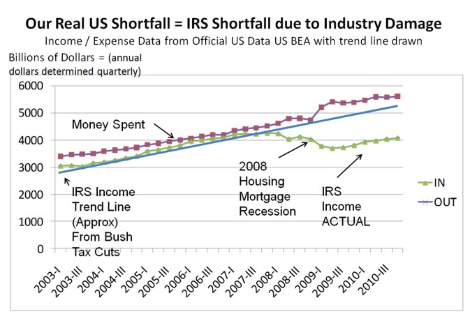
Note that in the above chart, IRS income is likely total Government income from all taxes and fees - since the US Department of Commerce measures Federal plus State plus Local levels.
The above chart shows a few things by me adding a construction line showing the income rise after the Bush tax cuts in 2001 taking effect it seems in 2003. And that first impact was that income rose $1 trillion between 2003 and 2007 and was starting to look good ... until the 2008 recession. Now by drawing this construction line (blue) I am trying to show something else. And that something else is that most of what I hear on TV regarding the US deficit is nonsense. Democrats say tax cuts hurt us. Republicans say President Obama spends too much. Neither of those two things are in evidence on this chart. This chart says income rose after the Bush tax cuts so Democrats are wrong. But Republicans are wrong also. The amount of added spending above the blue line is not the whole reason for the deficit. So both are wrong. What do we see from this curve with the blue line drawn? This is what I see makes up the current $1500 billion deficit a year:
About $500 billion in new spending. .. likely the Pres. Obama Stimulus over a few years
About $ 1 Trillion in damage to the US economy, damaged in 2008, but never fixed
And so, what does that mean? It means that the real reason for our US deficit is that the US economy is damaged and no one helped it grow back. In fact it seem to grow worse during 2009 and 2010. Now this is where I could kick myself. We see a huge figure like a $1500 billion a year deficit and we should ask why it is there? Taxes? That was not enough. Spending? No one, not even me could spend an extra $1500 billion a year. The answer once you see it should have been obvious. The only thing in the US huge enough for these kinds of numbers is if the US economy, the money machine that pays humans and also the government, was damaged. It is the only thing large enough to have caused that much damage.
So, how does one fix the US economy? Encourage it to return. That means likely lower regulations, less abuse of the job givers, and perhaps lower taxes as an incentive to kick start. I see few in Washington saying those things. But I do suspect, a few know it but are not talking. As for this data, once again, it is simply a matter of public record.
What is the good news? If any? It is my own opinion that economically the US does not have four woes, it only has one. The woes would seem to be the lack of jobs, the huge government yearly deficit, the housing crash and low housing rates, and low GDP - Gross National Product out the door. I now believe it is all one and same thing, which would make it easier to fix if it were to be understood. If one fixes the economy - meaning to ENCOURAGE business by lowering regulations and taxes and ill will and removing the new damaging programs, then first there will be more jobs. With more jobs and more businesses more revenue will come into the US treasury and the deficit will fall, and maybe we could even get back to the profit days of 12 years ago. And when people have jobs and have money, now they will want and need houses, and they will begin to drive the housing prices back up and so that market will be less depressed. And of course as our business begins to boom GDP, gross national product will also boom. Yes, the problem was simple. We stopped part of our engine in 2008, and no one as yet has fixed it. That is what the graphs and data tell me. But as always, feel free to reach your own conclusions. :)